CityEconomy AI: What Every Neighborhood Spends in the US

The neighborhood spending capture and leakage map that nobody had until now. Modeling and mapping US consumer spending patterns down to the Census Block Group level.
Every retailer, restaurateur, and city planner asks the same question — how much do the people in this neighborhood actually spend, and on what? The honest answer, for almost everyone, has always been: nobody really knows. Here is how we changed that.
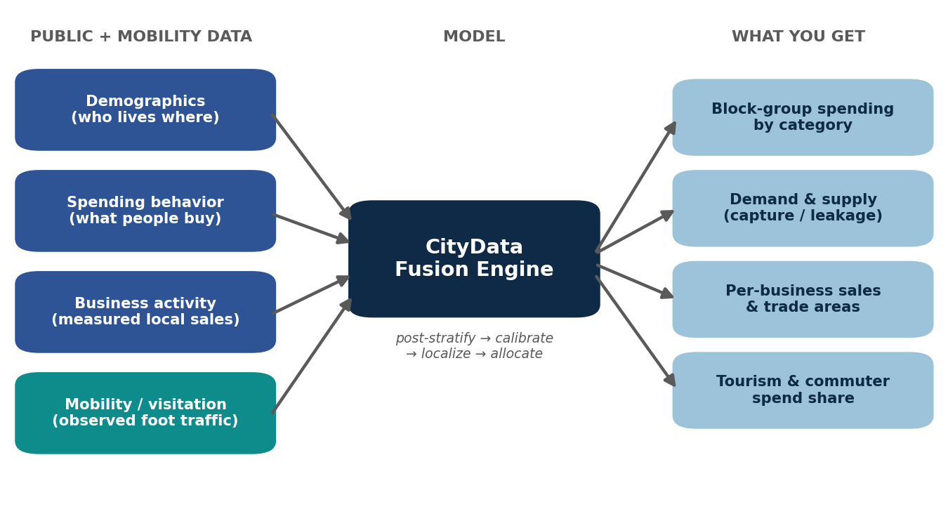
At CityData.AI, we build a consumer-spending estimate for every census block group in the United States — the smallest geography for which rich demographic data exists, typically a few hundred to a couple thousand people. Not a county. Not a ZIP code. A neighborhood. For each one, we estimate spending across the full household budget, we separate where people live from where they spend, and — where mobility data is available — we push it all the way down to the individual business.
This post walks through how the model thinks. We’ll show you the structure, the math, and the validation. We’ll keep the proprietary calibration under the hood — but you’ll leave understanding exactly why the numbers can be trusted.
The blind spot in the map
Public data gives you two halves of a map that never quite meet. One source tells you who lives where — income, household size, age, tenure — in extraordinary geographic detail. Another tells you how households spend — hundreds of categories, from groceries to gasoline to dining out — but only as broad national averages, with no neighborhood resolution. A third tells you what businesses sell — but only as totals rolled up to the county.
None of them, alone, can tell you the grocery spending, the restaurant demand, or the retail potential of a single neighborhood. The signal is split across datasets that were never designed to talk to each other. CityData’s model is the bridge.The core idea, in one lin
The core idea, in one line
The engine rests on a deceptively simple principle from small-area estimation: if you know how each kind of household spends, and you know how many of each kind of household live in a neighborhood, you can reconstruct what that neighborhood spends. Formally, for neighborhood i and spending category c:
Ei,c = Σq hi,q · mc,q
where hi,q is the number of households in neighborhood i belonging to demographic segment q, and mc,q is how much a household in segment q spends on category c. Sum across segments, and you have the neighborhood’s spending. Sum across categories, and you have its total. It is elegant, transparent, and — crucially — it ties back to official national statistics at every step.
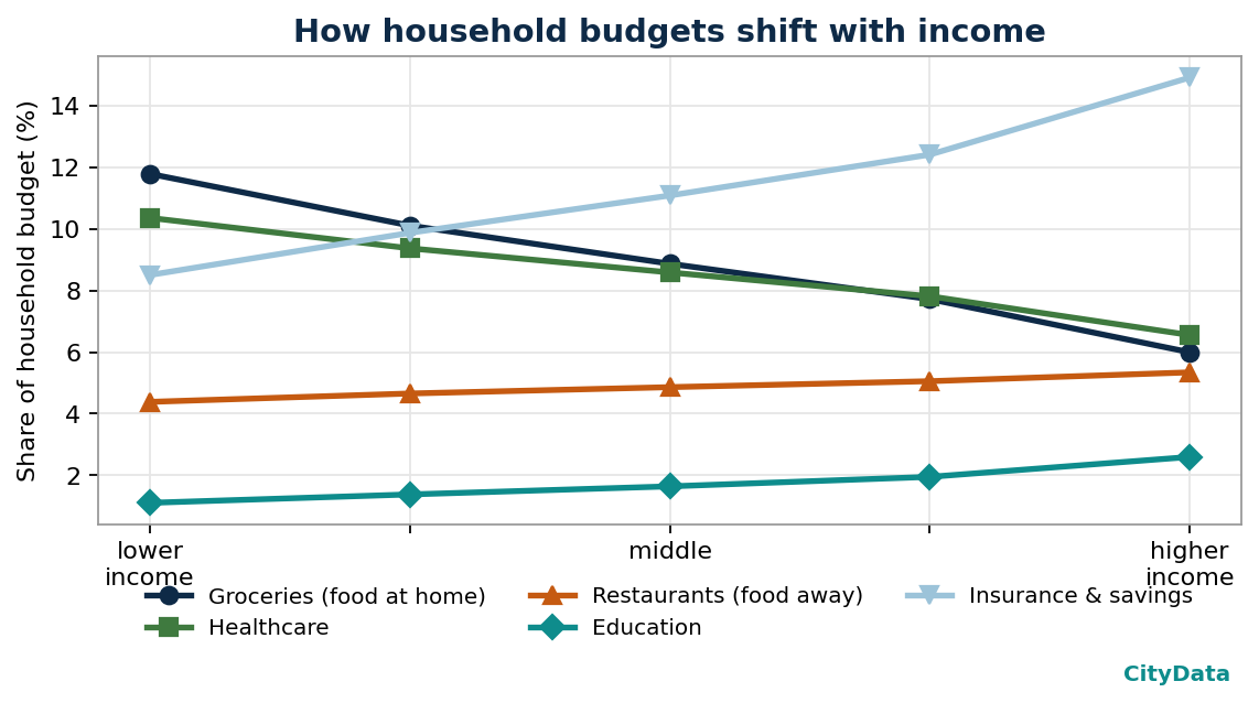
The art is in the mc,q: the spending behavior matrix. National statistics publish the margins of this matrix but never its interior, so we reconstruct the interior with an information-preserving fitting procedure (iterative proportional fitting, also known as RAS) that forces our matrix to exactly reproduce every published total while honoring the well-documented shape of Engel curves — the empirical regularity that, as income rises, the budget share of necessities falls and the share of discretionary and savings categories rises.
Not just national behavior but local patterns
A naive version of this model would simply stamp national spending patterns onto local demographics. We go further. Three calibration layers make the estimate genuinely local:
- Household composition. Spending scales with household size — but not uniformly. Groceries rise almost in step with the number of people; housing rises far more slowly because it is shared. We model that curvature per category.
- Housing tenure. Owners and renters carry very different housing cost structures. We split each neighborhood accordingly.
- Regional prices. A dollar of “housing” buys very different things in different metros. We re-base spending to local price levels, which is why high-cost regions surface correctly instead of being flattened to a national average.
The exact elasticities, price indices, and fitting parameters are CityData’s calibration — the part we keep proprietary. What matters for trust is that none of it is free to drift: the model is anchored, at the top, to official national spending totals, and at the bottom, to measured local sales.
Measuring demand is only half the story
Everything above estimates demand — what residents are likely to spend. But residents don’t only spend at home, and businesses don’t only serve locals. To capture the difference, we anchor the model to the measured business activity reported for each area, and compute a simple, powerful ratio for every county and category:
Capture = Measured local sales ÷ Modeled resident demand
A capture ratio above 1 means a place sells more than its residents could possibly demand — it is a net attractor, pulling in tourists, commuters, and regional shoppers. Below 1 means leakage — residents are taking their wallets elsewhere. This single number is the heartbeat of trade-area analysis, and our model produces it everywhere.
The leap: turning footsteps into spending
The most exciting layer is mobility. With anonymized, aggregated foot-traffic — hourly visitation and home-origin patterns for individual businesses — the model stops inferring where money is spent and starts observing it. We distribute each neighborhood’s category demand across the specific businesses its residents are actually seen visiting:
Spend(home → business) = Visits(home → business) · Spend‑per‑visit(home)
Add the visits arriving from outside the area, and you get a clean read on tourist and commuter spending. Re-scale the result so each county still totals to the officially measured sales, and you get the best of both worlds: official magnitudes, observed micro-shares. The output is a spending estimate for each named business — calibrated, defensible, and tied to the real economy.
Visits are not transactions, of course, and we are rigorous about that gap — device panels are reweighted to the population, home locations are probabilistic, and we never claim a footfall is a receipt. But as a measured signal of where demand is discharged, nothing in the public record comes close.
Does it hold up?
A model is only as good as its validation. Ours clears four bars.
1. It reproduces official totals exactly. By construction, the spending behavior matrix reproduces every published national category average and every income-segment total. The model never silently drifts from the source statistics.
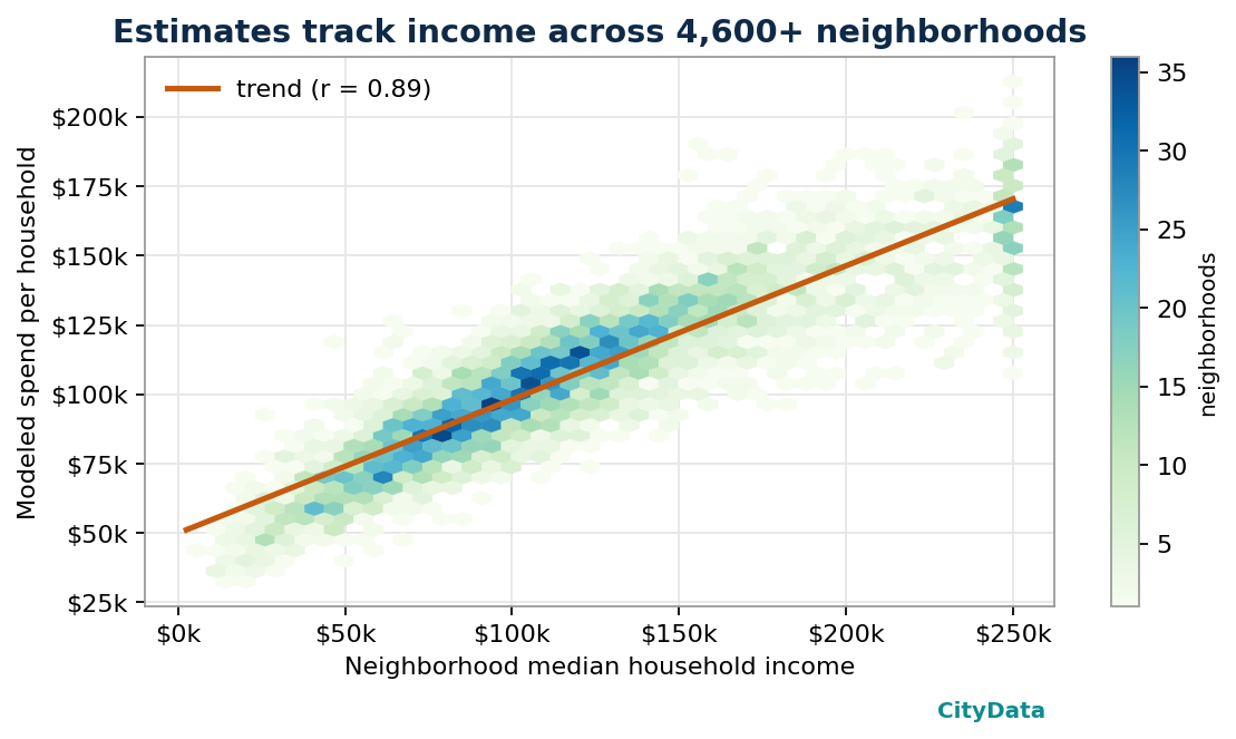
2. The right patterns emerge on their own. We never hand-code Engel curves — yet they appear cleanly in the fitted matrix (above). Emergent structure that matches decades of economic literature is a strong signal the mechanics are sound.
3. The income gradient is strong and sensible. Across thousands of neighborhoods, modeled spend per household tracks median income tightly, while household-size and tenure effects add realistic dispersion around the trend.
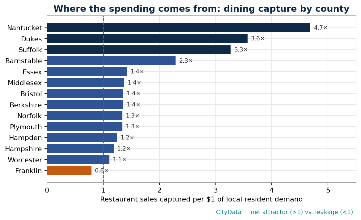
4. It recovers economic geography we already know. When we computed dining capture across Massachusetts counties, the model — with no knowledge of tourism — flagged the island and coastal destinations as massive net attractors and a rural inland county as the lone net-leakage market. That is the map a local economist would draw from memory. The model drew it from data.

The State of Massachusetts, by the numbers
| What the model delivers | Result |
|---|---|
| Neighborhoods covered (block groups) | 5,116 — every one in the state |
| Households represented | 2.79 million |
| Spending categories | 14 major + food, retail & fuel breakouts |
| Income–spend correlation | r ≈ 0.89 across neighborhoods |
| Calibration anchors | Official national spending + measured local sales |
| View | Demand and supply — capture / leakage everywhere |
Retail leakage analysis for each community
Of everything the model produces, this is the metric economic developers reach for first. Retail leakage is the gap between what residents of an area demand and what local businesses actually sell. Put the two surfaces side by side and the arithmetic is simple:
Retail gap = Resident demand − Local salesgap > 0 → leakage (demand flowing out) · gap < 0 → surplus (a net attractor)
Every dollar of leakage is demand your residents already have that is being spent somewhere else — a grocery run two towns over, a dinner downtown, an online order. Measured by category and by trade area, leakage stops being an abstraction and becomes a recruitment list: the specific store types your market can support today, backed by numbers a site-selection team will recognize.
The inverse is just as valuable. A surplus — the dining destinations, the regional shopping hubs — tells you where you are already winning, where to double down, and how much of your sales base depends on visitors you need to keep attracting. (Recall the dining-capture map above: the islands and the urban core run large surpluses, while a rural county quietly leaks its restaurant demand to its neighbors.)
Here is what a category leakage read looks like for a single trade area:
| Category | Resident demand | Captured locally | Gap & read |
|---|---|---|---|
| Groceries | $48M | $31M | $17M leak — could support another full-service grocer |
| Restaurants | $22M | $34M | +$12M surplus — a net dining destination; protect & promote |
| Apparel & general retail | $19M | $7M | $12M leak — strong recruitment target |
| Home improvement | $14M | $4M | $10M leak — underserved; nearest competitor pulls residents out |
Table: Illustrative trade-area example for explanation; CityData produces these figures from your area’s actual demand and measured local sales.
Two things make CityData’s leakage analysis different. First, resolution: because demand is built at the block group, you can draw a leakage map for a real trade area — a corridor, a downtown district, a proposed development site — not just a whole county. Second, where the mobility layer is available, leakage gets a destination: you don’t just learn that $17M in grocery demand leaves the area, you see the competing stores actually capturing those trips. That turns a gap into a strategy.
What this unlocks for cities and counties
If you lead economic development for a city or county, this is the analysis layer you have always needed but rarely had at neighborhood resolution:
| Question you can finally answer | How CityData answers it |
|---|---|
| Where is retail demand leaking out of our community? | Capture / leakage by category and neighborhood |
| What can this vacant corridor actually support? | Unmet demand by category within a real trade area |
| How much of Main Street’s revenue is tourists vs. residents? | Resident / commuter / visitor spend decomposition |
| Which neighborhoods are underserved for groceries or essentials? | Demand-vs-access gaps for equitable development |
| What’s our pitch to a retailer or developer? | Defensible, source-anchored spending evidence |
Recruit anchor tenants with evidence instead of anecdote. Target small-business support where unmet demand is real. Quantify the visitor economy. Make the case for a grant or a TIF with numbers a reviewer can trust — because they trace back to federal statistics.
What this unlocks for data teams
If you’re a data scientist or analyst, here’s why we think you’ll enjoy working with this:
- It’s a clean, queryable surface. One row per neighborhood, keyed to standard census geography, ready to join to your shapefiles, your CRM, or your own models.
- It’s rigorous, not a black box of vibes. Every number is anchored to a published statistic; the structure is principled small-area estimation, not opaque heuristics.
- It composes. Demand, supply, mobility, and per-business outputs are designed to be stacked, differenced, and modeled on top of. Build trade areas, void analyses, demand forecasts, or site-selection scores.
- It scales nationally. The Massachusetts build is a prototype of a method that runs for every block group in the country.
Why CityData.AI for Spending Patterns Data
We believe location intelligence should be rigorous, anchored, and explainable. We start from public statistics everyone can verify, we fuse in the measured signals — business activity and human movement — that turn inference into observation, and we are candid about what the model is and isn’t. That combination is rare, and it is exactly what serious analysts and serious public-sector decisions deserve.
Let’s map your market. Whether you’re building the next generation of location analytics or making the case for your downtown, we’d love to put this to work for you.
Economic development teams: ask us for a free capture-and-leakage snapshot of your county or your state.
Data scientists & engineers: let’s talk about data access, APIs, and building together.
Methodology note: this article describes the structure and validation of CityData’s block-group spending model. Specific calibration parameters, fitting constants, and coefficient tables are proprietary and intentionally omitted. Estimates are modeled values anchored to official public statistics and, where available, measured business activity and mobility data; they are intended for planning and analysis, not as audited financial figures.