CitySim Predictive Flow Simulations in Varanasi, India
Authored by Dr. Pieter Fourie with Team CityData.AI

A real-time rolling horizon flow prediction system for the most crowded heritage city on planet Earth.
1. Why This System Exists: Two Operational Missions, One Shared Infrastructure
This system was built because crowd management in a city like Varanasi requires two different types of answers, often under time pressure and with incomplete information.
Mission A:
What-if / decision support. The question is: “If we take an action, what happens?” Actions include closing or gating a street, altering access rules, or changing routing policies. These actions are inherently counterfactual—there is no direct data about the world that did not happen—so we need a model that can simulate the consequences.
Mission B:
Real-time forecasting. The question is: “Given what we are seeing now, how will the day unfold?” This requires short-cycle predictive updates as new sensor data arrives. Purely reactive dashboards are not enough: operators need lead time to implement interventions and communicate guidance.The core design principle is that these missions must share infrastructure.
The same simulation engine that supports counterfactual analysis also provides physics-consistent training data and features for real-time prediction. Conversely, real-time sensor data provides a continual reference signal that prevents the simulation from drifting into implausible states.
2. Why We Need Two Data Streams (and Why Neither Alone Works)
The system integrates two contemporaneous data streams:(1) Travel demand stream (passive mobility). This stream answers: “How many people intend to move, from where, to where, and when?” It is the best available proxy for intent and activity, especially when direct counting is sparse.(2) Sensor observation stream (camera counts). This stream answers: “How many people are currently passing key points right now?” It is the best available proxy for realized flows at specific locations.Why demand alone is insufficient: demand describes intent but not physical feasibility. In high-density pedestrian settings, congestion creates queueing and wave propagation that fundamentally alters arrival times and route choices.Why sensors alone are insufficient: sensors are sparse in space (only at instrumented points) and noisy in time (occlusions, classification error, device outages). A sensor provides local truth but not system state; it cannot tell us what is happening upstream or what will happen downstream.The system therefore uses demand to initialize and drive the flow field, sensors to anchor reality at key points, and simulation to infer the hidden state in between.
3. Why We Simulate Pedestrians (and Why We Use Ensembles)
Pedestrian movement in dense networks behaves like a coupled physical system: speed depends on density, bottlenecks create spillback, and localized surges propagate as waves. If we only model counts at sensors, we miss the mechanism that creates those counts.The simulation converts demand into a time-dependent network loading: link/area volumes, speeds or travel times, and congestion spillover. These variables are precisely what is required to forecast how a wave will hit future locations.Why ensembles: demand inference and behavioral parameters are uncertain. Even with the same day-level demand, small changes in departure time sampling, route choice sensitivity, or capacity assumptions can create different local outcomes. Ensembles produce a distribution of plausible states rather than a single brittle trajectory. This improves model robustness and prevents the ML layer from overfitting to one simulated “story” that may not match the day’s realized dynamics.
4. Why We Aggregate to Cluster-Level Functional Areas (and Not Link-Level Prediction)
A key design choice is to predict at approximately 100 functional clusters (plus sensor sites) rather than at individual link level.Motivation 1: Link-level signals are too noisy for stable learning. In pedestrian networks, small geometry differences and micro-routing choices can shift flow between adjacent links minute to minute. When the target variable is noisy, the ML model learns noise instead of structure, training becomes unstable, and forecast variance explodes.Motivation 2: Sensors are sparse. Without widespread observation, link-level supervision is weak. Many links have no direct measurement; any link-level model would be trained mostly on simulation-derived targets, risking model drift.Motivation 3: Operational decisions are area-based. Real interventions are not “change link 39803’s flow”; they are actions like gating an entry corridor, closing a street segment, or redirecting movement across an area. Functional areas align with how operators think and act.Therefore, we aggregate the network into clusters that represent coherent pedestrian functional areas: areas where movement is strongly coupled internally, and comparatively weakly coupled externally. This preserves meaningful spatial structure while improving signal-to-noise ratio and training convergence.
5. What “High Modularity” Means and Why It Matters
Modularity is a standard measure in network science for how well a graph is partitioned into communities. Intuitively, it compares the amount of “within-cluster” connection (or flow weight) to what we would expect if connections were random given node degrees.Why we care: If clusters have high modularity, most movement stays within clusters, and cross-cluster flows are relatively small. That is exactly what we want when forecasting and when designing interventions:• Forecasting benefit: Cluster-level state is more stable over time because internal flows dominate. The model can learn repeatable temporal patterns.• Intervention benefit: If cross-cluster coupling is limited, interventions at cluster boundaries can be targeted and have predictable effects.Operationally, modularity helps us avoid arbitrary grid cells. A grid may cut through a tightly coupled market area and merge unrelated corridors. High-modularity functional areas better reflect real pedestrian systems.
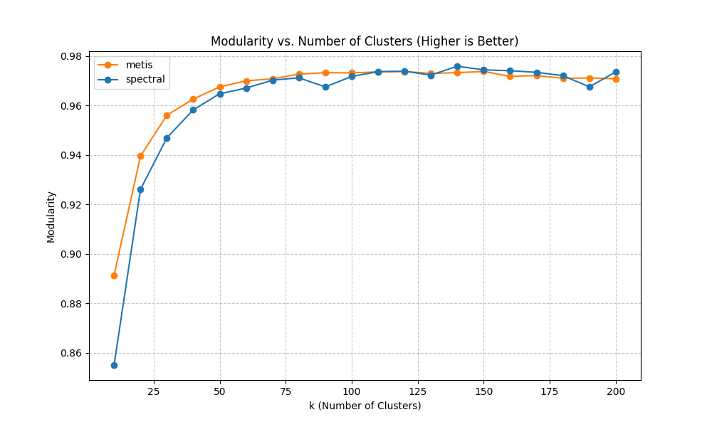
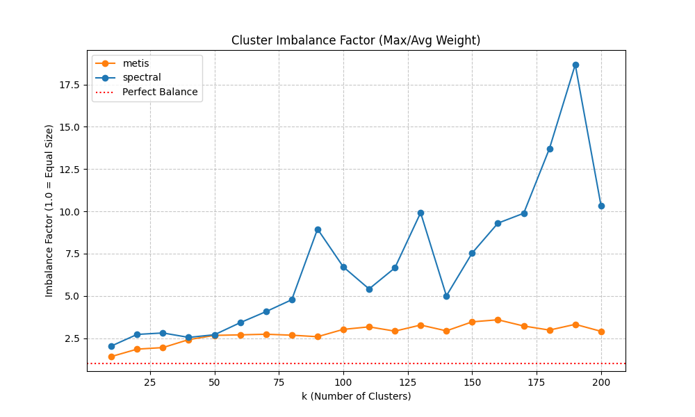
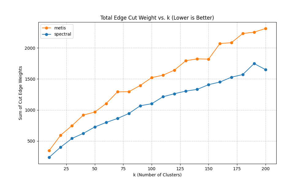
6. Why We Tested Two Clustering Methods (Spectral vs METIS) and What the Plots Mean
We tested two approaches because clustering is a design decision with real downstream consequences. We need not only a partition, but one that simultaneously supports prediction stability, interpretability, and intervention design.Method A: Spectral clustering. Spectral methods use eigenvectors of a graph Laplacian to embed nodes into a lower-dimensional space that captures connectivity structure. In practice, spectral clustering is often strong at discovering “natural” communities when the graph has meaningful global structure.Method B: METIS-style partitioning. METIS is optimized for producing balanced partitions while minimizing edge cuts. It is widely used in scientific computing and can be very effective when balance and cut size are primary objectives.Why spectral can appear ‘much better’ in our context: pedestrian networks have corridors and basins that are globally structured. Spectral methods can capture these long-range structural modes, producing communities that align with intuitive functional areas. METIS, while excellent at balancing, can sometimes over-prioritize balance and local edge cuts, potentially splitting a coherent core corridor to equalize sizes.That said, the choice is not ideological: we compare them empirically using diagnostic metrics shown in the optimization plots.
7. How We Chose the Number of Clusters (k) and Why We Care About Balance
Choosing k (the number of clusters) is a trade-off. Too few clusters and we lose spatial resolution; too many and we reintroduce noise and reduce training stability.We evaluate candidate k values using three diagnostics:(a) Modularity vs k (higher is better). This tells us whether the partition captures strong community structure. In many systems, modularity increases rapidly at first and then saturates. Saturation indicates that increasing k yields diminishing returns in “community quality.”(b) Imbalance factor vs k (lower is better). We define imbalance as the ratio of max cluster weight to average cluster weight (or a closely related measure). Why balance matters: a single oversized cluster can dominate the learning problem and hide localized dynamics, while many tiny clusters can be dominated by stochastic noise. Balanced clusters improve statistical stability and training convergence.(c) Total edge cut weight vs k (lower is better). This quantifies how much weighted connectivity is cut by cluster boundaries. Lower edge cut means clusters are more internally coherent and less coupled. However, edge cut often increases with k because more boundaries are introduced; the goal is to avoid pathological growth.Why we picked ~100 clusters: empirically, this range provided a ‘sweet spot’ where modularity was near its plateau, imbalance remained acceptable (no extreme giant clusters), and the edge cut remained manageable. Importantly, this k also matched the constraints of available supervision: we have a small number of sensor sites, so the model needs aggregated targets to learn stable relationships between simulated loading and observed counts.
8. Why Min-Cut Boundaries Matter (Beyond Aggregation)
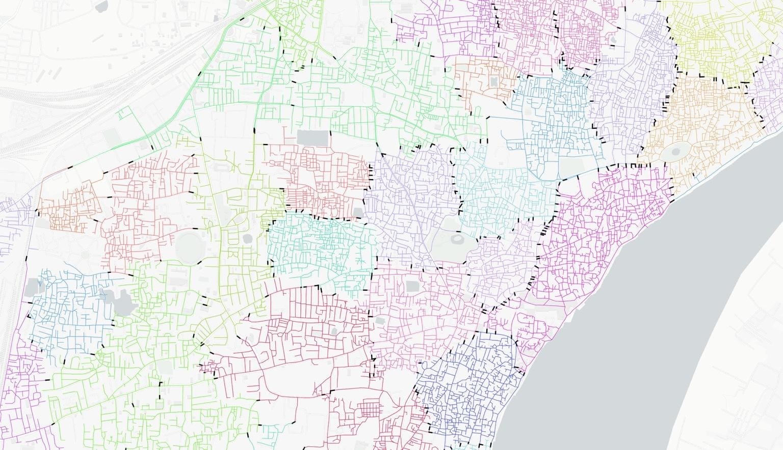
Functional clustering gives us an aggregation scheme, but it also enables intervention logic through boundary analysis.Min-cut is a graph-theoretic concept: for two sets of nodes (or clusters), the min-cut is the set of edges whose removal disconnects them with minimum total weight. When weights represent capacity or flow, min-cut edges represent the smallest “gate” through which coupling occurs.Why we compute min-cuts between clusters:• Intervention targeting: If we need to reduce inflow into a congested cluster, the min-cut boundary identifies the smallest set of boundary links where controls (gates, diversions, closures) would most effectively reduce coupling.• Minimizing collateral disruption: By targeting min-cut edges rather than broad closures, we reduce unintended impacts on adjacent functional areas.• Explainability: Min-cut edges produce a clear, defensible narrative for why a particular corridor is a critical control point.This is why the cluster visualizations show likely min-cut links (black). They are not decorative; they encode actionable intervention structure.
9. Why Rolling Horizon Updates Every 30 Minutes and Predicts Up to 240 Minutes
Operational forecasting must balance responsiveness with computational feasibility.Why 30-minute cadence: it aligns with practical operations cycles (briefings, field redeployments) and provides enough new data to materially update the state while avoiding constant retraining noise. It also matches the computational cost envelope: we can ingest sensors, run simulation updates, and publish forecasts reliably.Why up to 240 minutes horizon: event management needs lead time. Many interventions require logistics, staff movement, and communication. A 30–60 minute horizon is sometimes too short. Extending to 240 minutes enables earlier planning while still remaining within a horizon where demand and behavior assumptions are not entirely dominated by long-range uncertainty.Crucially, because the system is rolling, long-horizon forecasts are not ‘set and forget’; they are revised every half hour as new observations arrive.
10. Why the ML Layer Looks the Way It Does (Hybrid Features, Pickling, Deterministic Tuning)
The ML component exists because purely simulation-based forecasts can be systematically biased when demand inference or behavioral parameters are imperfect. ML learns the mapping from the simulated state (plus time context) to observed counts, effectively correcting simulation bias while preserving physical structure.Why hybrid features: Using both simulation-derived loading (physics) and sensor counts (reality anchor) yields better generalization. Simulation provides coverage across the network and plausible propagation, while sensors ensure alignment to real magnitudes and timing.Why deterministic hyperparameter optimization: For operational systems, we need reproducibility. If tuning is stochastic, stakeholders cannot trust that performance changes are due to meaningful improvements rather than random seeds. Deterministic tuning supports traceability and controlled iteration.Why pickling the trained model: In live operations we want fast inference. We train offline, serialize the model artifact, and reuse it in the rolling loop. This makes the runtime cycle primarily about data ingestion, simulation state update, and prediction—avoiding heavy retraining every 30 minutes unless explicitly desired.
11. Figures and How to Read Them
The figures included below are selected because they directly support the system motivations above: validation, aggregation rationale, and operational visualization.
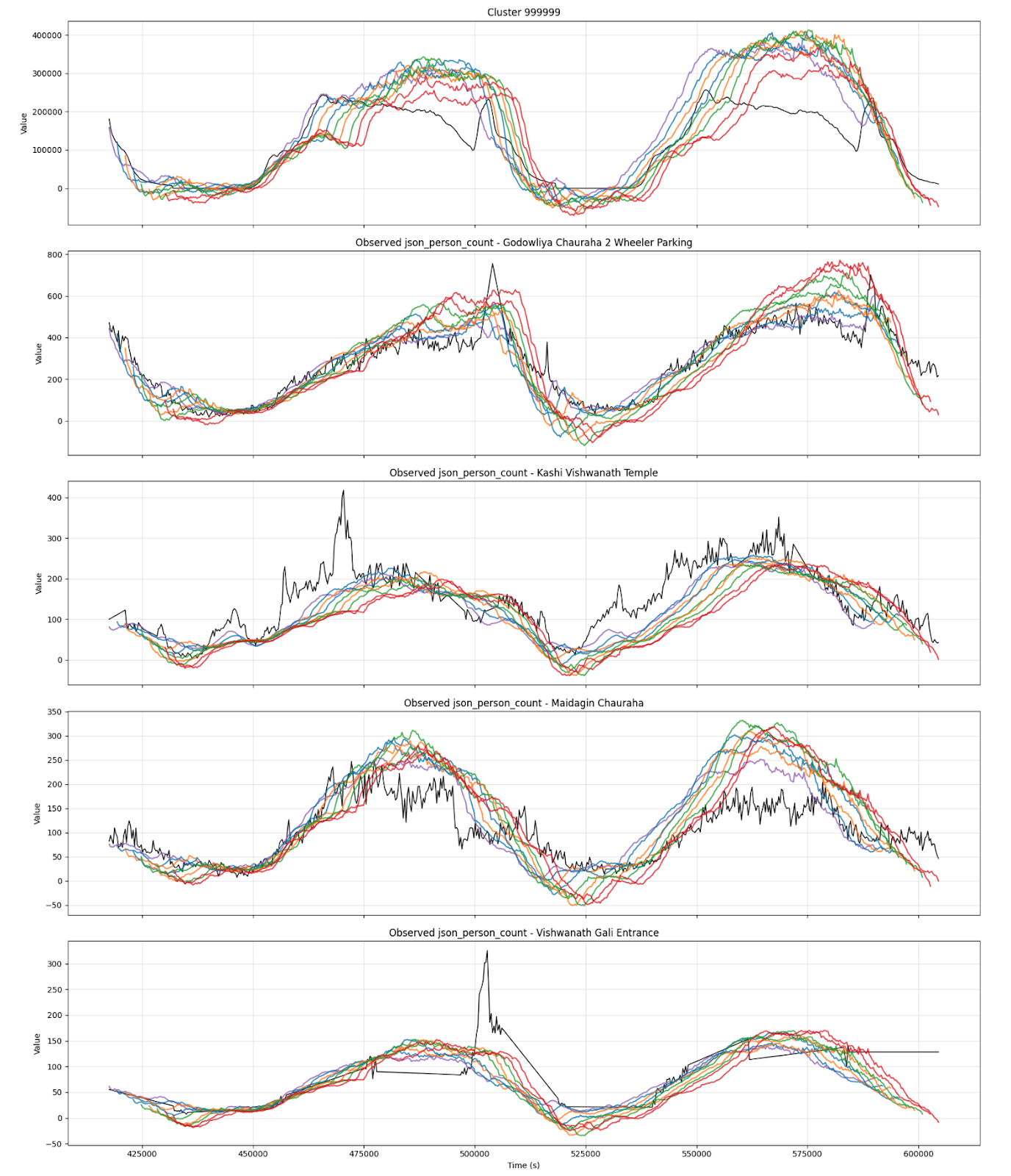
11.1 Rolling Horizon Prediction vs Observed Validation
This plot shows successive forecast curves (colored) compared with observed counts (black) for four instrumented sites and one core-area cluster. The key point is not perfect pointwise matching; it is that the model captures the timing and magnitude of the main daily waveforms and adapts as new data arrives.
11.2 Functional Areas and Min-Cut Boundaries
This citywide map shows the functional area decomposition. Colored regions represent clusters (functional areas). Black boundary links highlight likely min-cut edges, which are candidate control points for interventions. The core-area zoom emphasizes how fine-grained clustering supports operationally meaningful control.

11.3 Clustering Optimization Diagnostics
These diagnostics justify the choice of clustering method and k. We compare spectral and METIS using modularity (community strength), imbalance (size stability), and edge cut weight (boundary coupling). The selected k aims to sit near a modularity plateau while keeping imbalance and edge-cut manageable.
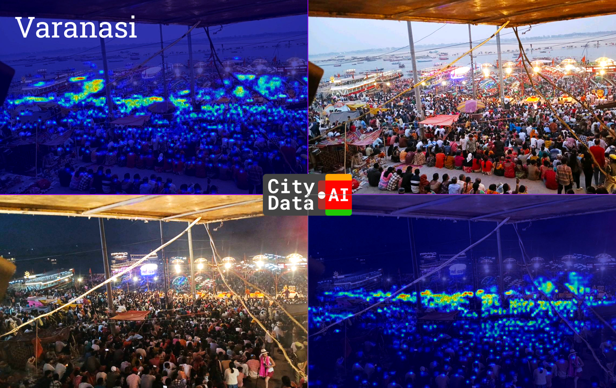
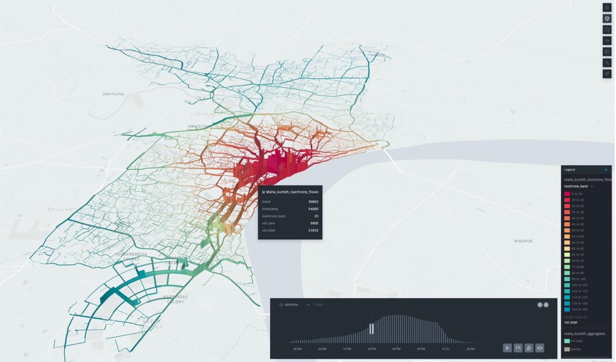
11.4 Operational Visualization: Isochrones and Volume During Maha Shivratri
This Kepler visualization illustrates how simulation outputs can be rendered into stakeholder-friendly layers (isochrone bands and volumes). It provides an operational bridge between technical outputs and decision-maker intuition.
12. Practical Implications for Operations and Phase-2 Scaling
Because the system is built around functional areas with identified boundary control points, it supports a coherent operational workflow:• Detect: sensors reveal deviation from expected patterns.• Diagnose: simulation + cluster state identifies where waves are building.• Forecast: rolling horizon predicts likely future peaks at clusters and key sites.• Intervene: min-cut boundary links provide candidate gates/closures to reduce coupling into hotspots.• Evaluate: what-if scenarios quantify the likely redistribution effects before implementing.Phase 2 can therefore focus on strengthening reliability (deployment hardening, monitoring), expanding calibration across more event days, and integrating intervention recommendations into dashboards and standard operating procedures.