Challenges and Solutions in Geofence Edge Visitation Analysis

Abstract: Geofences are the cornerstones of spatial analysis, underpinning applications from park visitation to customer foot traffic measurement. However, inferences about visits become particularly intricate at the geofence's edge. This article delves into these challenges, exploring the factors that inflate visit counts and proposing best practices for accurate visit determination.
Introduction:
At CITYDATA.ai, geofences are the lifeblood of our business. We translate the real world – parks, trails, open spaces, downtown zones, commercial zones, industrial areas, business districts, transit centers, buildings, road networks, restaurants, shops, brands, businesses, event venues, and everything in between – into digital representations that unlock a treasure trove of insights.
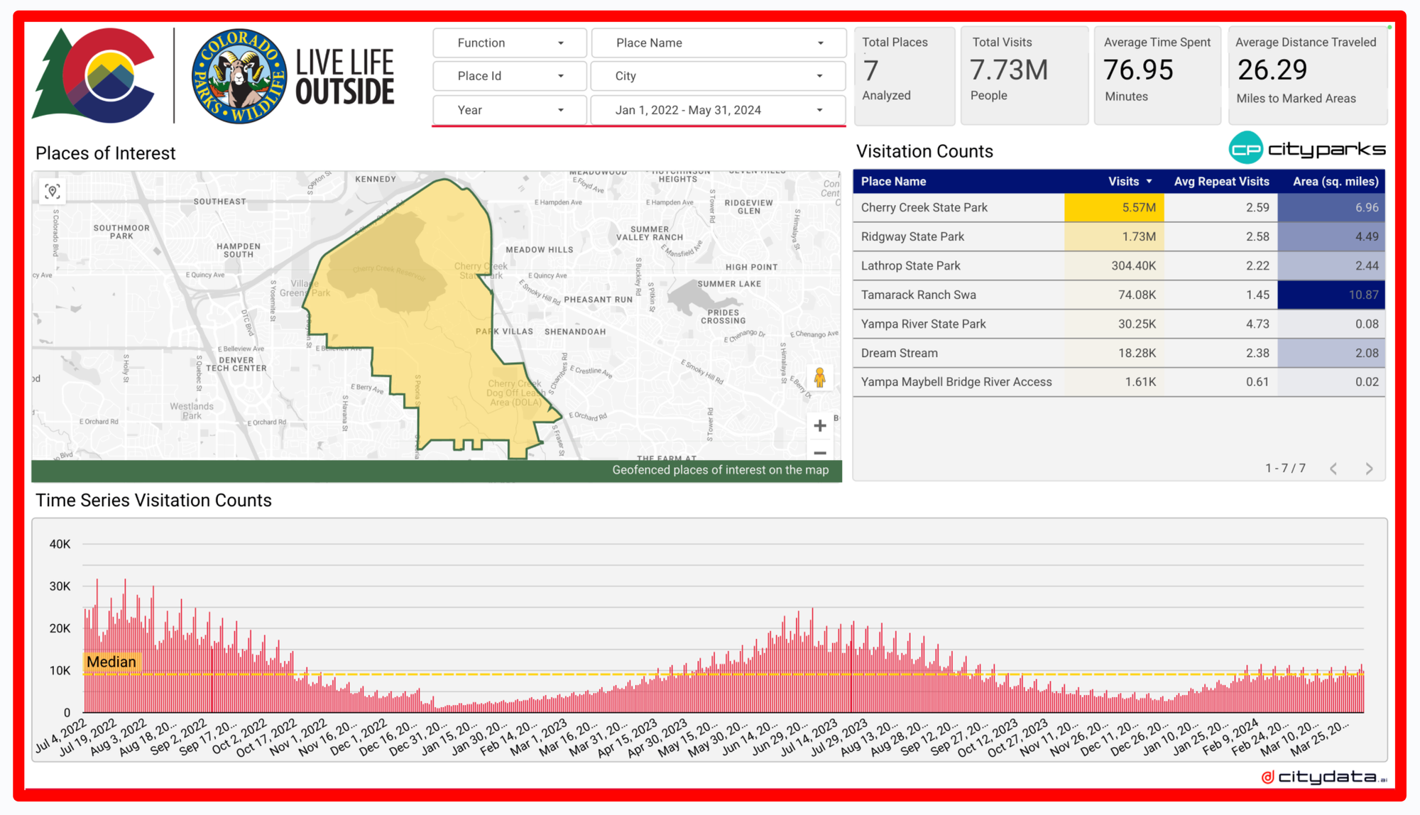
Our CITYPARKS.ai solution, for instance, empowers state park authorities like the Colorado Parks and Wildlife Department. The online dashboards and cloud data tables measure visit counts, dwell time, hourly trends, daily trends, and long-range month-over-month, and year-over-year trends for a large collection of geofences. CITYPARKS.ai also features high-resolution GPS heat maps and movement maps for the geofences.
Visits are inferred by extracting the anonymized GPS data points from the crowdsourced mobility data using the geofence shapes. By filtering these points through meticulously designed geofences, we infer visitations. However, as with any scientific endeavor, challenges arise, particularly at the geofence's periphery – the edge.
The Edge Dilemma:
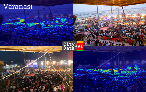
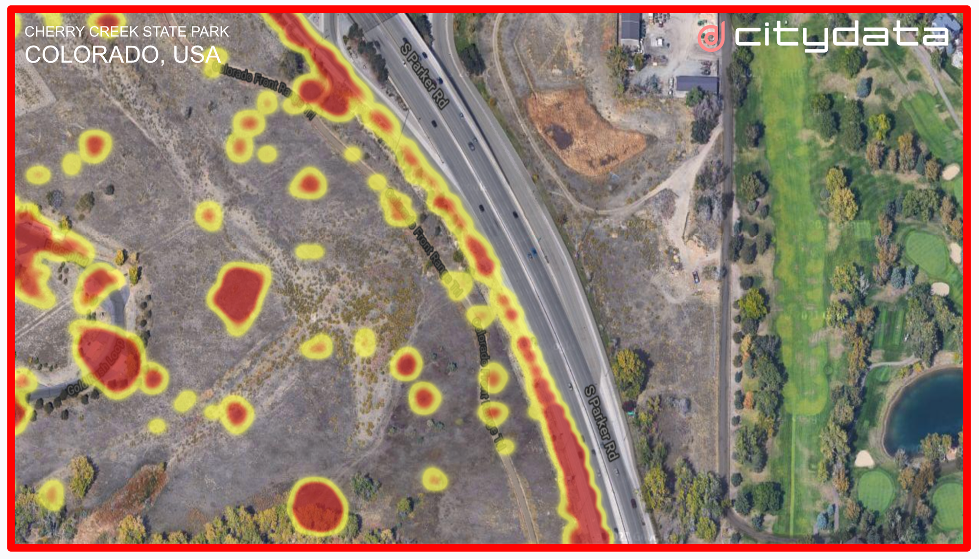
Imagine a heat map depicting park visits. Often, the edges blaze with activity, especially when bordering sidewalks, roads, or high-traffic areas.
As an example, below is the complete GPS dataset for Cherry Creek State Park in Colorado, filtered by using the yellow geofence that represents the shape of the park. The GPS data points are plotted as a heat map. The bright red areas are hot spots within the park with high levels of activity. The yellow areas indicate relatively lighter activity.
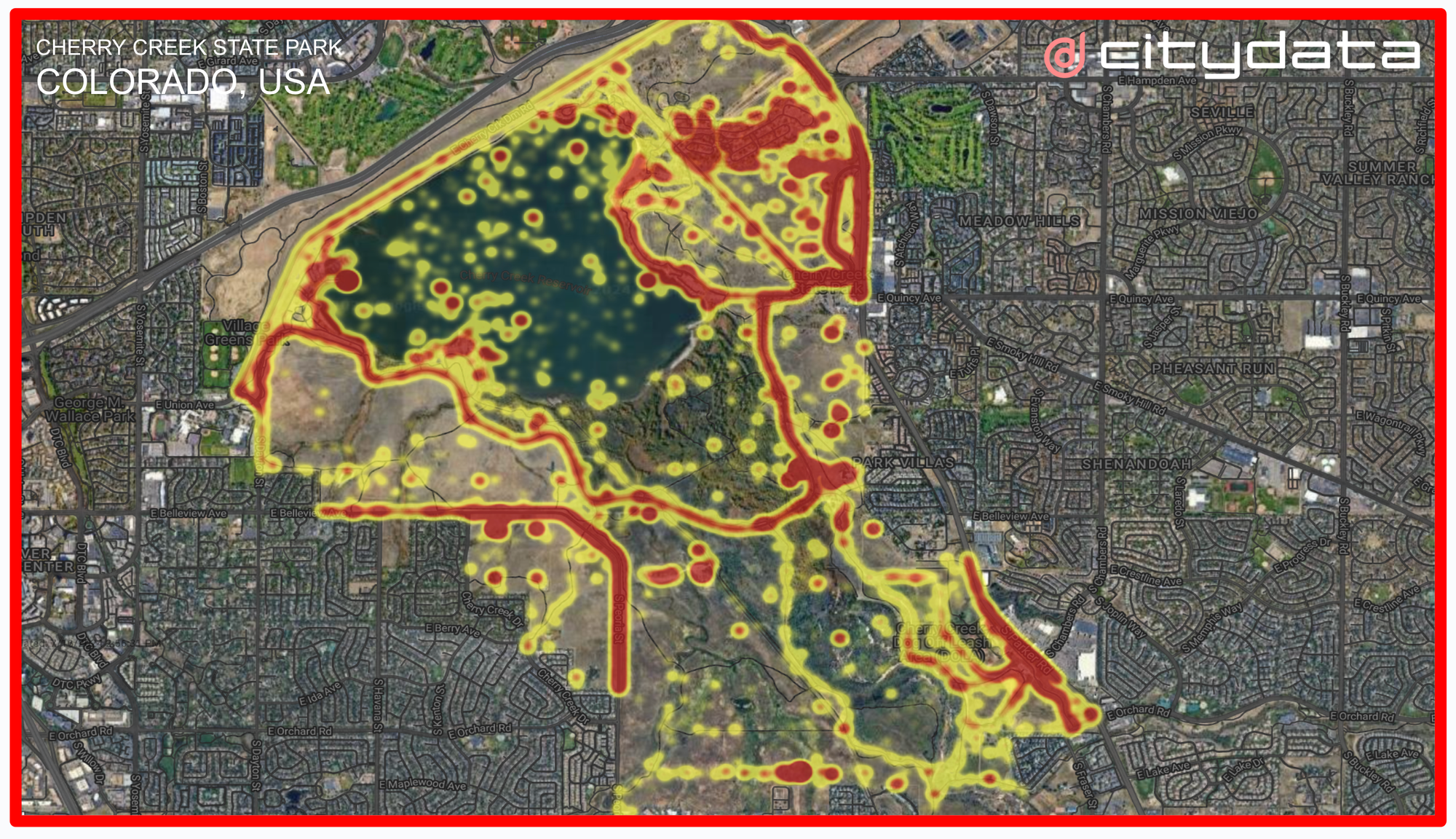
While the methodology of inferring visits using geo-temporal clustering techniques is an established science, the inferences can get challenging at the edge or at the border of the geofence. We often see the heat maps turn bright red at the edge of the geofence especially when the geofence is adjacent to sidewalks, roads, and features with high foot traffic or high vehicular traffic. This is the edge dilemma.
Edge dilemma stems from several factors. The two most common factors are:
- Geofence Overlap: A geofence might encompass a sidewalk or road, leading to an influx of data points from passersby or vehicles, erroneously inflating visit counts for the geofence.
- GPS Data Fluctuation: The accuracy of GPS location data points can fluctuate due to factors like cloud cover, buildings, or even trees. This inherent fuzziness can blur the lines between being inside or outside the geofence.
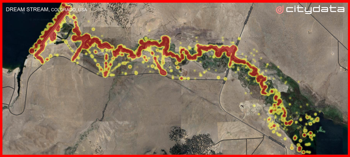
Cherry Creek State Park:
Let's continue to use Cherry Creek State Park as our case study. In the northeast quadrant of the park, its geofence slightly overlaps with the sidewalk and the adjacent road, leading to a swarm of GPS data points from individuals walking or driving along the edge.
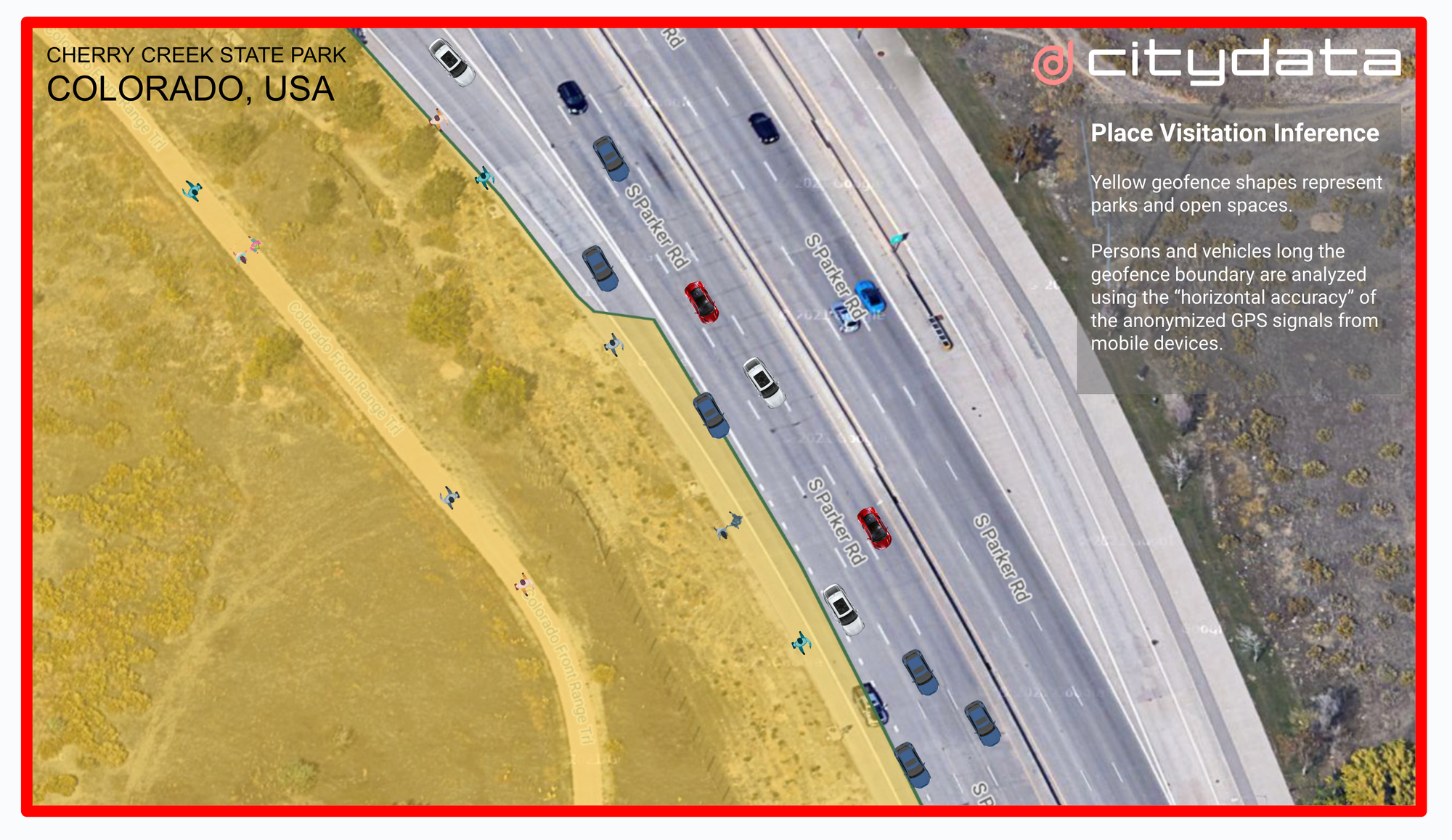
The image below shows the zoomed-in view of the geofence boundary or edge along the northeastern section of Cherry Creek State Park. As you can see, the yellow geofence overlaps with the sideway and also overlaps with the road.
It is easy to spot persons walking or biking along the edge or driving on the road adjacent to the edge as shown in the the satellite image. Anonymized GPS data sourced from the mobile phones of these persons and from the connected vehicles to understand if they have "visited" the geofence. These data points come with an associated "horizontal accuracy" – a measure of how close the reported location is to the actual position. For instance, a 5-meter horizontal accuracy implies that the data point likely falls within a 5-meter radius of the true location.
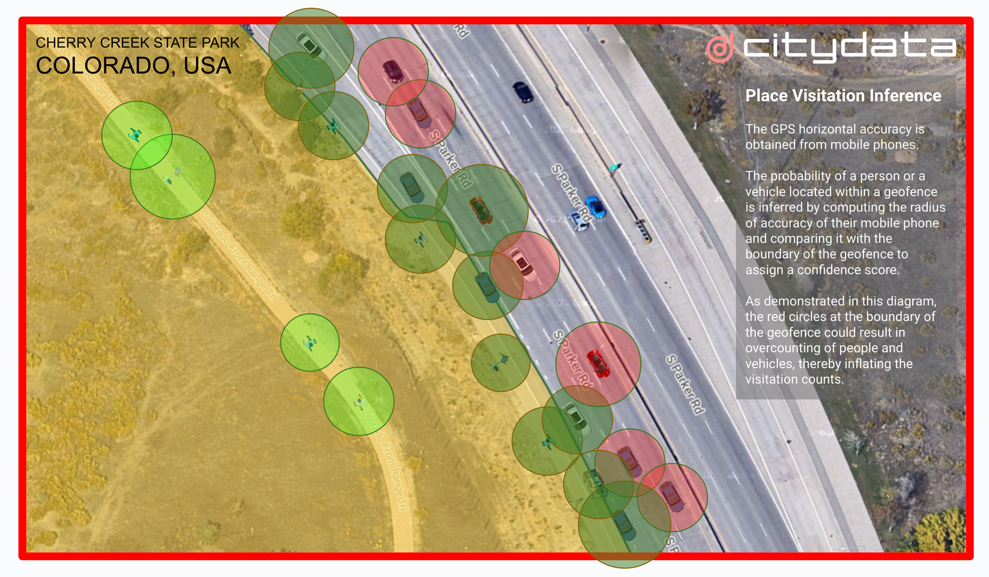
Circles of Influence
To address the edge dilemma, we introduce the concept of "circles of influence" that are based on the horizontal accuracy. Imagine a circle drawn around each data point, with the radius determined by the horizontal accuracy. These circles provide a visual representation of the potential area the user might occupy.
Real-world GPS data points in our crowdsourced mobility dataset have an average horizontal accuracy of 5 meters or 16 feet. Horizontal accuracy may also fluctuate because of cloud cover, trees, and the built environment.
For Cherry Creek State Park, we have drawn the horizontal accuracy based "circles of influence" for people and vehicles at the northeast edge.
- Red Circles: These represent individuals or vehicles clearly outside the geofence, with no overlap between their circles and the geofence boundary. We can confidently exclude them from visit counts.
- Dark Green Circles: These circles partially overlap with the geofence, indicating some possibility of a visit.
- Bright Green Circles: These circles are entirely contained within the geofence, signifying a 100% likelihood that these user actually visited the park.
However, relying solely on these circles is insufficient. We employ a technique called "spatiotemporal clustering" to solidify the inference. This involves grouping data points from the same device over a specific time window (e.g., 2 minutes) within the geofence. Only when this clustering occurs can we definitively confirm a visit to the geofence.
Best Practices for Accurate Visit Determination:
Conquering the edge dilemma requires a multi-pronged approach. The steps outlined below can help to increase the accuracy of visitation inferences by overcoming the edge challenges for geofences::
- Creating High-Resolution Geofences: Utilize high-resolution satellite imagery to create precise geofences that minimize overlap with irrelevant areas.
- Consulting Local Agencies: Collaborate with local authorities to validate geofence definitions and ensure they align with their understanding of parks, trails, downtowns, business districts, commercial or transit zone boundaries.
- Communicating with Stakeholders: Discuss with clients or stakeholders whether features like sidewalks should be included within geofences. This transparency fosters trust and ensures data relevance.
- Defining Minimum Visit Time: Establish a minimum time threshold for a visit to be counted. As an example, the threshold could be 3 minutes for a coffee shop, 10 minutes for a park, or 20 minutes for a downtown zone. This helps differentiate between someone walking or driving past the geofence and someone truly entering it.
- Filtering Data by Accuracy: Use high quality crowdsourced GPS mobility data and filter it down to retain only data points with a maximum horizontal accuracy of 10 meters (33 feet). While this works for most geofences, narrower areas like trails might necessitate a stricter threshold of 3 meters (10 feet). Exclude all data points that fall below the minimum horizontal accuracy threshold to produce a higher-confidence mobility dataset for visit inference.
- Filtering Data by Circles of Influence: Remove all data points whose horizontal accuracy based circles of influence do not overlap with the target geofence.
- Inferring Visit Clusters: Apply spatiotemporal clustering to confirm true visits within the geofence based on multiple data points from the same device within the minimum visit time threshold.
- Calculating Dwell Time: Compute the dwell time or the stay time for each visit and produce a distribution of dwell times for the day or the week.
- Correlating Demographics: Correlate the visitation patterns to the home neighborhoods for the visiting devices to infer demographic characteristics by using a privacy-compliant approach based on the US Census or ACS open data.
- Publishing Tables and Dashboards: Finally, aggregate the visit counts, dwell profile, distance traveled, hourly, daily, weekly and monthly trends to publish meaningful insights as data tables and interactive dashboards.
About CITYDATA.ai
CITYDATA.ai brings mobility big data + AI to make cities smarter, safer, and resilient. Our technology platform publishes multiyear visitation data for parks, trails, downtowns, commercial zones, and business districts for +9000 cities around the world. We provide insights about people counts, density patterns, movement trends, economic impact, and community engagement.
Founded in 2020 in San Francisco, California, CITYDATA.ai provides fresh, accurate, daily insights that are essential for smart city programs, economic development, urban planning, mobility and transportation, tourism, parks and recreation, disaster mitigation, sustainability, and resilience.
You can reach out via email at business@citydata.ai if you’d like to discuss your data needs and use cases. You can also follow the company on Linkedin, and the UniverCity.ai blog to stay updated on the newest innovations in big data and AI for the public sector.